
Perricone MD
Role:
I was a Product Designer tasked to optimize the site and add new features to Perricone MD's responsive e-commerce site.
Projects include: mobile menu redesign, product detail page feature adds, cart redesign, checkout flow optimization, product advisors, and more.
Team:
The team was comprised of three people. The Digital Product Manager who created and drove all the projects, an external Product Designer who functioned as Principal Product Designer/UX Strategist/UX Guru, and a second Product Designer (me). I feel incredibly fortunate to work under such a talented and experienced group people and they're the reason these projects turned out so well.
All the files, images, prototypes you see below were created solely by me under the guidance and approval of the Digital Product Manager (internal) and Principal Product Designer.
New PDP (Product Detail Page) Feature:
Perricone MD's makeup line expanded into the realm of multiple colors and sizes and the Product Detail Pages needed to accommodate this new feature.
Video of Prototype:
This sample of the prototype shows the new Colors & Sizes feature. Hovering over each option provides a change of states that give the user a quick and easy look at all of their buying options.

Checkout Flow Optimization
User Flow & Checkout Flow 'Recipe'
To make life easier for the engineers who have to build this or anyone trying to follow a flow with many parts, I show a basic template recipe for each step of the flow and then highlight only the exceptions in the user flow.
Cart - Evaluation & Research:
Areas that need improvement are highlighted with references to outside research for the Product Manager to use as ammo to sell the project. Areas done well are also highlighted (gray).
This is an example of the heuristic evaluation that was presented to the client.
Cart - Desktop Before & After
The Order Summary so that it's always above the fold and break the components into blocks that can be easily used in mobile. More efficient organization of the product info shortens the overall page.
The biggest change is the introduction of the "Checkout as Guest" CTA which eliminates the need to log in and allows a user to completely bypass the Login Inceptor page.
In the e-commerce world, 85% of checkouts are guest checkouts. This change is expected to yield big improvements in the checkout funnel.
Cart - Mobile Before & After
The improvement in page length seen in Desktop isn't as big in mobile but the sticky CTAs will always be visible.
Product Advisor (Questionnaire):
Challenges for this project included minimizing copy (for what could otherwise become a very long read), providing helpful but unobtrusive descriptions, and showing the user their progress within the questionnaire.
Video of Prototype:
This is the second generation of the prototype that was used to test users. An interesting learning was how important using the right imagery is. We had originally used a named product image and one user became suspicious that our questionnaire was just a device to push only that product.
(note: Although I'm not responsible for most the copy, the 'UX Guru' and I strongly pushed for the minimal language of the progress bar (clickable). The previous version used multiple words for the name of each step making translation to mobile very difficult.)

The guts of the prototype for those that love seeing the inner workings:

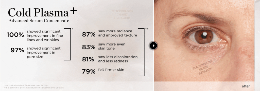
"Twenty-Twenty" Before & After Feature
The "Twenty-Twenty" feature allows a customer to see side-by-side before & after comparison images.
Flinto prototype