Book Ahead Feature for Croissant
My Team Roles
I worked with a team from start to finish. Here are some of the areas I participated in:
○ Evaluation of existing product
○ Competitive research
○ Design Studio ideation and UI concept sketches
○ User Testing
○ Lo-Fi screen development
○ Hi-Fi screen development
○ Icon design
About Croissant
Croissant was founded in New York City in 2015 with the mission to make every day inspiring and make beautiful workspaces easily accessible to people everywhere.
The service has been described as a 'ClassPass for workspaces.' It allows users to drop in to any workspace that's part of their network and check in on the spot.
Call To Action
Croissant allows users to work at coworking spaces on-demand by themselves or with guests. Croissant had heard from customers that they want to be able to book seats in advance when they need a place to work or have meetings. They wanted a "book-ahead" feature.
It was important to our clients that the new book-ahead feature felt familiar to existing users and also had a flow that would be easy to use for first time Croissant users.
Icon Design
I'll jump straight to the final icon design since this is the the part of the project I can say was very much 'mine' even though nothing on this project was done without teamwork.
Summary: I wanted to create an icon set for the tab bar that fit the Croissant brand. It was a challenge to get the active and inactive icon versions to feel 'equal' when changing from outlined to filled.
The Profile icon borrows the companies croissant-coiffed mascot in smiling form. It's too cute and too unique to not place somewhere prominent (don't want to overuse it either).
The Community icon has a familiar group-of-people-icon look to it but it's a little different. The ubiquity of the 'three heads' icon speaks well to the meaning of Community but it was softened up a little to keep with Croissants friendly brand image.
The My Seats icon was an original creation of a cozy and playful comfy chair. Next to the Profile icon, this was the most difficult to translate from outline to fill seamlessly.
The Discover icon used to be a map/location arrow. The meaning of the magnifying glass is well understood as "search", and that's just what it was. So I created a softer version.
Now back to the beginning of the story...
Competitive Research
Understanding Croissant's Users
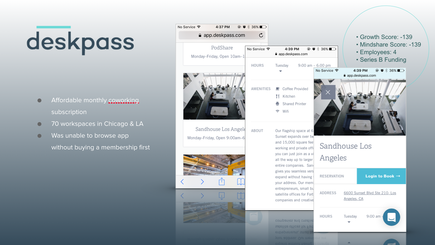
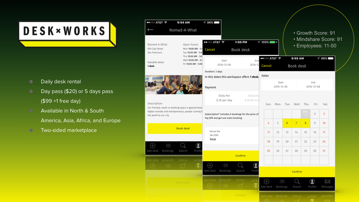
The co-founders provided connections with existing users on both coasts. Interviews were done either in person or over the phone to understand the existing users and their needs and wants. Our team also experienced the current check-in/check-out process in person at local spaces like Covo in SOMA.
“I think that would be a great idea. I usually try to plan my week of coworking out in advance, so that would be a helpful feature. My only concern would be if that would cause very popular spaces to book up and become impossible to get into...”
Booking flow
Users expect there to be a time box but ideally want to specify check-in time only when booking ahead. Our clients wanted to avoid having to specify a check-out time while booking too.
Mixed feedback on whether or not book ahead feature should be separate
- Book ahead should be a third option alongside check-in now and hold a seat
- Book ahead should be an added feature where you put $ deposit down for a reservation and reservation would not count against hours
- Book ahead should be integrated with hold a seat
Users want a way to sync reservation to calendar and have a reminder
Booking limitations
- Users that work with others at a space said there should be a limitation on the number of reservations
- People who use Croissant more regularly should have priority for reservations
Cancellation policy
- Those booking ahead should be able to cancel reservations at any time or at least within 1-2 hours of the reservation
- If users abuse reservation system, start charging
- Users would feel anxious about not being able to make reservations in time
- There should be a penalty for no-shows like ClassPass ($5 fee or deduct hours)
- There should be at least a 15 minute check-in grace period because users feel anxious about not making reservation in time
- Cancellation policy would be communicated on the confirmation page after you reserve
Other Findings
We discovered that being able to favorite workspaces was a popular idea so we would end up including that feature in our final proposal though it wasn't part of the original scope of the project.
Persona
Our clients' biggest market is in NYC and that market is what drives the need for booking ahead. Being based in San Francisco, it's important to remind ourselves that the users we're most focused on are in an environment where workspaces can become scarce much more often.
Ideation
After gaining a good understanding of the existing app and the existing users, a Lean UX-style Design Studio was run to generate multiple directions within the span of a single day. Individuals diverged on ideas, then two teams converged on ideas generated within their respective teams and the result was two UI sketch proposals that would each become Lo-Fi prototypes to be tested on users.
Lo-Fi
The product of the Design Studio exercise was translated in to "Lo-Fi" wireframe prototypes. They appear to be closer to Hi-Fi prototypes because it was quicker to base the prototypes off of screenshots of the existing app. The tab bar was also modified because of feedback that users were confused by the meanings of the original icons. We didn't completely solve that problem in the first go-around. Some would be confused by the Bookings icon for the new tab we added. Pretty sure that's my fault but we're still at Lo-Fi and there will still be plenty of opportunities for making those better.
Analysis
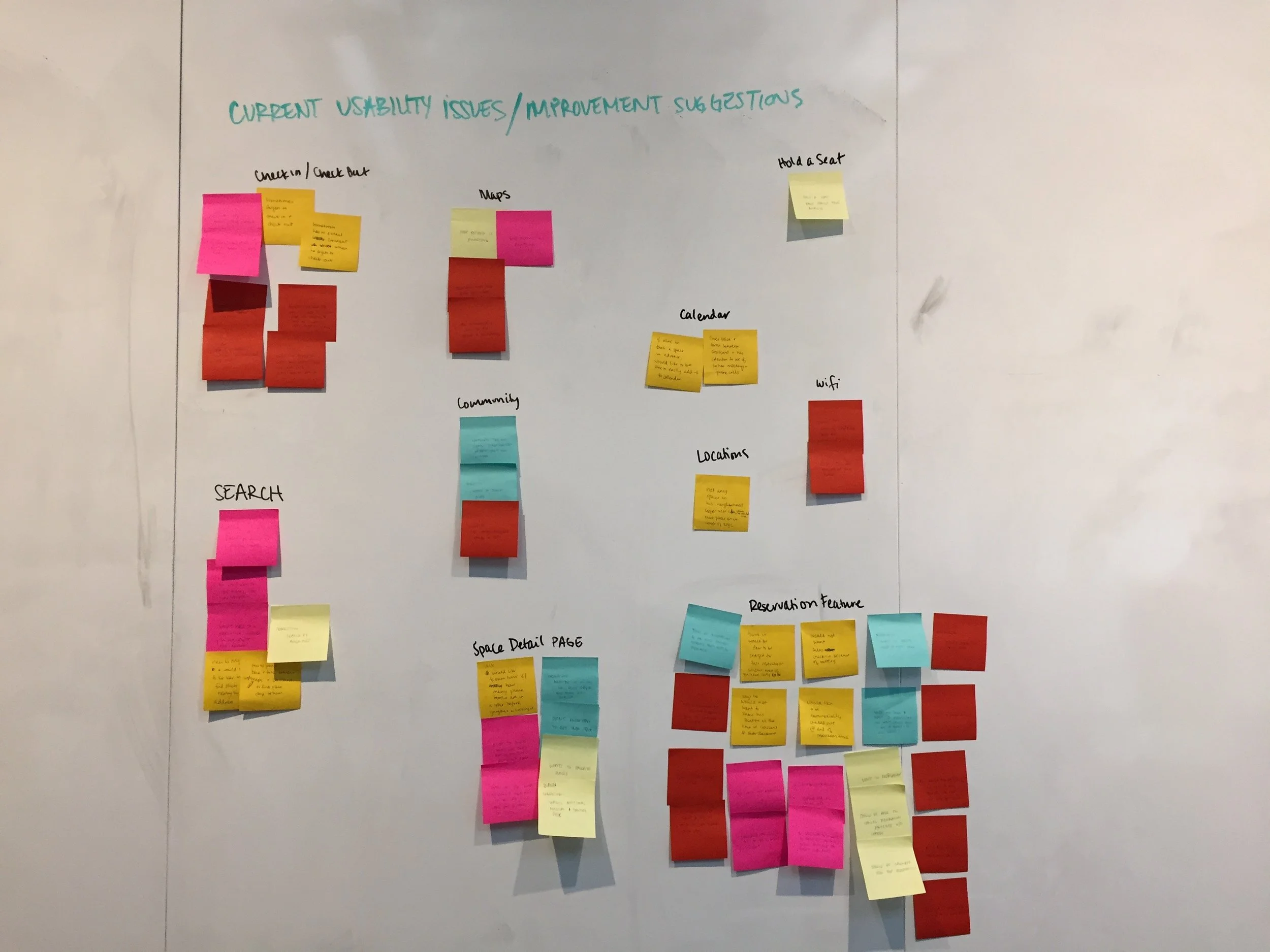
User testing was performed on different versions of lo-fi prototypes and the feedback was grouped based on common themes and prioritized based on user and business needs. The timeline didn't afford the ability to test on as many users as we would have liked but because the concepts had many similarities, we hoped the limited testing would show crossover wins and pain points. It's visible from looking at the colors of the grouped pain points that users had relatable experiences with both prototypes.
Filtering
Adding a search filter was a big change from the experience of the Croissant app but was a key component of the Book Ahead feature. I created a set of filters for what I'm calling a "mid-fi" design. We used snapshots of the existing app for the foundation of our early prototypes and it wasn't much effort to make them look fairly refined.
Changing these filters changes the results shown on the Discover tab. We tried to nestle everything with a dropdown cue that showed the city and date selection but that wasn’t enough to guarantee users would find the new feature so we added a common filter icon. Color was another big change. We ditched the ‘Croissant gray’ background and moved to white to make the app feel lighter and friendlier.
Hi-Fi Prototype
My Takeaways
We tried to test an ambitious number of variations from more than one design sub-team. Tracking the results of testing to the prototypes wasn't an impossible challenge and didn't prevent us from achieving our goals but it added a little chaos. Could a collaboration tool for Sketch have helped us avoid some chaos and get a little more sleep? I think so.


